
Health Data Literacy: A Story is Worth 1,000 Data Points
October is Health Literacy Month! Health literacy seems more important now than ever, with multiple sources identifying poor health literacy as a barrier to COVID-19 response efforts.[i],[ii],[iii] John Zarocostas identified COVID-19 as an “infodemic” as much as a pandemic.
Data analysis has long been purely numbers focused. Data analysts often produced results designed to appeal to other analysts. Now, data analysts are paying more attention to their audience, focusing on tailoring messaging to make it easier for more people to understand the data’s significance. Effective analysis now incorporates elements of information design, user experience, education, and even psychology to guide the consumer toward understanding the data—without needing someone on hand to explain it.
Two of Lantana’s public health analysts, Laura Blum and Heather Dubendris, took workshops with data visualization expert Dr. Stephanie Evergreen. Dr. Evergreen teaches a four-step process for creating effective data visualizations, stressing the importance of knowing your audience: Who will be looking at your data? What do they care about? You must consider the data literacy of the audience and their level of interest as well as the cultural or regional differences, which may have an impact on the way your audience interprets your data. Even the color scheme for visualizations can impart meaning, whether intentional or otherwise. Tools such as Dr. Cynthia Brewer’s ColorBrewer tool and Dr. Evergreen’s Qualitative Chart Chooser inform intentional selection when visualizing data. This shift towards data as a storytelling tool also lends itself to simplicity. Dr. Evergreen encourages small multiple graphs to show stratified data rather than stratifying on a single graph which often leaves the primary message open to interpretation.

In addition to visual concerns, people remember stories better than numbers or decontextualized facts. We assign our own narrative meaning to things that we see and hear. Therefore, visualized data should provide meaning or insight into the story you are telling. Anything that helps someone to connect personally or emotionally also helps them understand and remember. Sandra Mullin, MSW, harnesses these narrative instincts to get her message across. For example, she uses “raw and real” stories of individuals sickened by secondhand smoke exposure to convey the dangers of tobacco in a more visceral way than impersonal data on morbidity and mortality rates in Malaysia.

In addition to data analytics, health data development is also moving toward a data storytelling approach. Agile modeling, a software development approach emphasizing users over developers, conveys project requirements through user stories. It’s easier for the public to connect with a personalized phrase, like the one below.
“As a patient, I don’t have time for and can’t affor d repeated tests. I need my doctor to access my medical history even if I move or change providers.”
As opposed to a statistic like “About 1 in 20 individuals who had been to the doctor last year reported having to redo a test or procedure because their prior data was unavailable.”
Both phrases convey the need for a better way to exchange health information between providers, but the first one describes the situation in a way that anyone can understand. This personal story could also serve as an opening to present key survey data points.
Easily-understandable language is so important to comprehension that—through the Plain Writing Act of 2010—we now have laws requiring federal agencies to use clear communication that the public can understand. Section 508 and the IT Accessibility Program further ensure those with visual and hearing impairments can access digital content. The 21st Century Cures Act specifies electronic health record (EHR) reporting criteria for usability and user-centered design. Considering that poor EHR usability can actually harm patients, it’s about time.
Lantana contractor and senior statistician Matt Sapiano, in collaboration with the Centers for Disease Control and Prevention (CDC), used some of these best practices in data visualization and storytelling to develop a dashboard for the Adjusted Ranking Metric (ARM) within the National Healthcare Safety Network (NHSN) application. The ARM is a measure for hospital-acquired infections (HAIs) that accounts for differences in HAI exposure between hospitals. The ARM Reliability-Adjusted Rankings, intended to supplement other HAI measures such as the Standardized Infection Ratio (SIR), display a percentile for each HAI type. Lower percentiles indicate better performance, while higher percentiles indicate worse performance. The dashboard shows hospitals how well they prevented various HAIs compared to other hospitals.
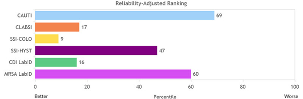
By condensing complex information about HAIs into a simple scale, from better to worse, Matt and the NHSN team help hospitals identify where their prevention efforts can make the most impact. Concise, easy to digest information like this can make a huge difference in the resource-strapped healthcare industry.
In addition to data literacy principles, Lantana incorporates tech editing, plain language expertise, user experience design, and graphic design into almost everything we produce for our clients. We strive to improve our clients’ understanding of the data we present to inform their decisions. Here’s to making the world a better, more understandable place!
[i] https://www.ncbi.nlm.nih.gov/pmc/articles/PMC7156243/
[ii] https://www.ncbi.nlm.nih.gov/pmc/articles/PMC7303647/
[iii] https://www.medpagetoday.com/infectiousdisease/covid19/87002